Commentary
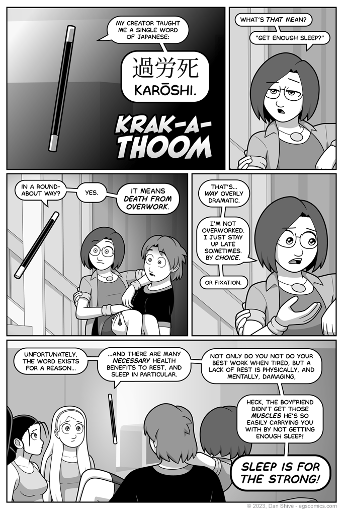
I made a point of including this word because it is a word that exists for a very real, very unfortunate reason, and I first learned of this word from an anime that might have saved my life (at a minimum, it significantly improved my overall health and wellbeing).
It’s based on a light novel, so prepare yourself for a long title:
I've Been Killing Slimes for 300 Years and Maxed Out My Level
It’s not my favorite series, nor is it one I’ll run around recommending to everyone who’ll listen (THAT honor goes to Bocchi The Rock).
It IS an anime, however, with a first episode that got me to significantly reduce dangerous habits.
It’s a “in another world” (isekai) anime in which someone is reincarnated after dying from overwork at their desk in the middle of a work day.
The first episode emphasized the importance of moderation, and of taking care of yourself.
It made a big impression on me at a time when I’d sometimes stay up past sunrise working on comic stuff, and get up 3-4 hours later to, in theory, do more comic stuff (assuming I could even manage it).
That was very dangerous behavior, but in spite of feeling absolutely awful so much of the time, I didn’t think of how harmful it actually was until an anime witch named Azusa snapped me out of it.
Kanji
I'm not sure why I felt I should include the kanji (Japanese text)? It's there more as a result of it feeling proper than me thinking "ah, yes, this is the logical reason I have deduced to include the kanji."
Whatever was going on in my head, my understanding is the first kanji can refer to overdoing something, the second can refer to labor / toil, and the third is just about death. I don't see a separate context for it, which I suppose makes sense. If you're going to have a symbol for death, you probably don't want to mix it in with a bunch of unrelated things.
This is me as an amateur repeating information I've found, so if I'm mistaken in some way, I apologize.
EDIT - It turns out I originally used a Simplified Chinese font for the text. My amateur eyes missed the minor differences, but someone with less amateur eyes pointed it out.
Fortunately, I had an actual Japanese font that looked how I wanted, and I switched it to that.
I'm making this quick edit on my day off, so an image of the before and after will be in the NEXT commentary, but the big difference was the top square within-a-square in the first symbol was on the left instead of the right in first font I used.
--
EGSNP returns tomorrow!


